Windows Phone 8.1 Review
by Anand Lal Shimpi on April 14, 2014 10:00 PM EST- Posted in
- Smartphones
- Microsoft
- Mobile
- windows phone
- Windows Phone 8.1
Final Words
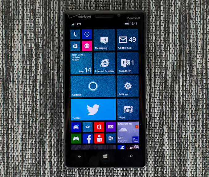
Windows Phone 8.1 is a much needed and well thought out upgrade to the WP platform. Action Center is extremely well executed. The new keyboard brings the most polished implementation of shape writing to Windows Phone. IE11 is faster and more compatible than IE10. And Cortana offers hope in the way of eventually turning Windows Phone into even more of a personal digital assistant. The upgrades are solid.
In terms of high level features, Windows Phone 8.1 brings the platform up to near parity with Android and iOS. If what you’re doing is calendar, basic camera work, email, SMS, web browsing, Facebook and Twitter you can have a good experience on all three platforms. In fact, there’s an attention to detail that Microsoft exhibits in Windows Phone 8.1 that at times rivals that of Apple. I suspect this is why Windows Phone users, although a small portion of the market, are generally satisfied with their platform.
With Windows Phone however, Microsoft finds itself in a very frustrating position. It lacks the marketshare necessary to make Windows Phone a primary target for developers. Apps are more likely to launch first on Android and/or iOS. Part of the problem is one of marketshare, the other part is one of philosophy. For the past 3.5 years Microsoft needed to rev Windows Phone more frequently than Android or iOS, and it needed to be on the forefront of hardware adoption as well. For whatever reason, Microsoft did neither. Windows Phone saw, at best, as many major OS updates as Android/iOS, and at worst trailed the two in terms of minor updates. I’d argue that both Android and iOS changed more since Windows Phone’s introduction than WP itself, which shouldn’t be the case as both of those platforms are far older (and thus should be more mature/changing less substantially). On the hardware side, it’s important to note that no one ever wins by consciously choosing slower hardware. Building efficient software is one thing, but failing to use the latest hardware isn’t doing anyone any favors.
Last year saw Microsoft accelerate its software release cadence, and by the end of the year was on parity with Android in terms of high end Qualcomm silicon support. These two trends must continue through 2014 and beyond for Windows Phone to continue to grow. The UI needs regular updates/tweaks to keep it fresh but also keep it evolving towards perfection. With faster hardware on the horizon, Windows Phone can no longer be the last to support the latest platforms. I can’t say I have a ton of faith that Windows Phone will become the launch platform of choice for new silicon, but I do hope the lag between what is offered on Android and WP will narrow to at most a couple of quarters.
Microsoft has a huge opportunity in its universal app strategy. Being able to run the same app on smartphone, tablet, notebook and desktop is a sort of holy grail for the next stage in the computing evolution. I honestly see the biggest strength there in gaming, but for that to work out Microsoft not only needs to push its mobile hardware more than anyone else but it also needs to treat Xbox as a platform and not as a console.
So what about Windows Phone 8.1 today? The hardware is decent and the software just saw a solid upgrade. Going back to the platform after a significant hiatus I’m quickly reminded of why it is a reasonable third choice. I’m still not a fan of the overuse of text as a navigational element, but between Action Center and aggressive use of the start screen you should be able to avoid a lot of that. Personally I'd still prefer Android or iOS. The Google services experience is understandably better under Android and unless you're using Skype exclusively, messaging is better under Android and iOS. Then there's the third party app story. The Windows Phone Store is healthier today than it was four years ago, but if you want the latest and greatest apps as they hit the market you'll want to be on Android or iOS. (Can I also add that only having three brightness settings and a ton of devices that won't let you force the display on makes testing these things a nightmare?)
I believe Windows Phone’s biggest strength continues to be as an entry level smartphone platform. If you don’t need the flexibility and bleeding edge feature/app set that Android offers, and you don’t want to invest as much financially into moving to iOS, Windows Phone offers a unique middle ground between the two platforms. With the majority of growth in the smartphone space over the coming years moving to the entry level and mainstream segments, that’s Windows Phone’s real opportunity. What’s needed is the Moto G equivalent in the Windows Phone space. The high end Nokia devices are interesting from a camera perspective, but I suspect the real chance to win is if Nokia can point its camera excellence at a more mainstream price point.


111 Comments
View All Comments
sonicmerlin - Monday, April 14, 2014 - link
Why doesn't anyone add test reflow to their browsers? Only android browsers have it, and it makes reading on the web so much easier. Instead with IE 11 MS actually made the font smaller. The added "reader" mode doesn't work on forums or comment sections, and I actually like the layout amd colors of web pages.I would totally buy a windows phone if the browser had text reflow.
at80eighty - Monday, April 14, 2014 - link
ios has had it a while nowMyrandex - Sunday, April 20, 2014 - link
The iPhone 4s that I had running iOS 5 didn't contain this feature.comomolo - Tuesday, April 15, 2014 - link
Actually both Chrome and Firefox for Android DO NOT reflow text. I think Opera for Android is still the best in that regards. Firefox DID it at some point, so there's hope it'll be re-enabled in the future.emn13 - Tuesday, April 15, 2014 - link
Reflow is a standard part of every webbrowser. What specific UI or use-case are you talking about?UpSpin - Wednesday, April 16, 2014 - link
No, I just tested it on the latest Opera Mobile and Chrome for Android.Just open this website here. Of course, Chrome does arrange the website content to make the best of it on a mobile display, but if you want to further zoom in, the text doesn't get rearranged, only increased and you have to scroll to the sides to continue reading. That's different with Opera. As soon as you zoom in, the text gets rearranged so you don't have to scroll to the left or right.
looncraz - Thursday, April 17, 2014 - link
Go to settings and turn it on.Omega215D - Monday, April 21, 2014 - link
The standard Android web browser does this. I'm using it right now on the stock broswer in my HTC One. As for Chrome I think you have to enable it, though some sites may not play well with text reflow.girishp - Tuesday, April 22, 2014 - link
The standard web browser for Android is Chrome, HTC doesn't use Chrome by default. HTC ships a tweaked version of the browser and enables Tex-Reflow on.The problem with Text-Reflow is that it re-arranges the visual elements, typically with poor results. Text is readable, but the content looks bad. I used to disable this on HTC phones.
KarenKLawler - Tuesday, April 15, 2014 - link
Compared to images, text is *obviously* language dependent. I often think the white text on black background motif is overdone since it makes apps look rather monotonous. Screens have color for a reason, color communicates a LOT more densely that text ever will. http://s6x.it/l521