The iPhone 5 Review
by Anand Lal Shimpi, Brian Klug & Vivek Gowri on October 16, 2012 11:33 AM EST- Posted in
- Smartphones
- Apple
- Mobile
- iPhone 5
Display: Now 16:9 with full sRGB Coverage
Section by Brian Klug
A huge part of the story of what’s new in the iPhone 5 is obviously the display. At a high level what’s different is pretty simple sounding: aspect ratio is now 16:9, resolution is 1136 x 640, gamut coverage is now almost exactly sRGB, and the digitizer is now in-cell as opposed to on-cell. Let’s go through those changes.
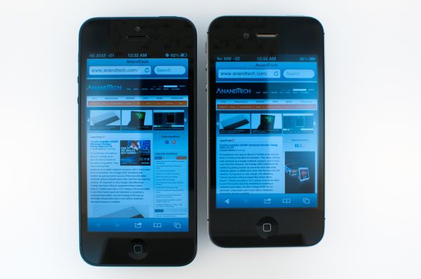
iPhone 5 (left), iPhone 4S (right)
Since the original iPhone days, aspect ratio for the phone has been an immutable 3:2, and later on the iPad adopted an aspect ratio of 4:3. All the while, the aspect ratio wars for content and media have been warring, and by now it’s obvious that 16:9 has won. YouTube changed over to 16:9 just a year after the original iPhone launch, and since then other sources of content have moved that way as well. We saw 16:9 take over as the dominant HD format, and like it or not the same has played out on the PC with a march from 4:3 to 16:10 to 16:9. The move to 16:9 for the iPhone now enables most modern video content to play back without (or with very little) letterboxing, and simultaneously expands the viewport a considerable amount for other applications. A huge number of iOS applications are essentially a list view or a tabbed view with a list down below, and thus are immediately suited in portrait rotation to take advantage of more vertical space. I spend most of my time in portrait mode with rotation locked on iOS, and increasingly it seems as though landscape rotation is a marginalized view for application developers, so this seems to be a sound path forward.
The route Apple chose to get the iPhone to 16:9 is now widely known. They kept width the same at 640 pixels and roughly 5 cm, and instead opted to make the display taller, at 1136 pixels and roughly 8.85 cm, up from 960 pixels and 7.39 cm on the iPhone 4/4S. Interestingly enough 1136 isn’t exactly 16:9, a closer target would be 1137, but we’re talking about one or two pixels that simply get cropped out on video decode and display for most media.
I’ve talked about how Android is now an almost entirely 16:9 camp, and that really frames my thoughts about the iPhone 5’s display size change. In the past, switching back and forth between iOS which was 3:2 previously and modern Android handsets that were 16:9 never felt very extreme. There was a noticeable difference in overall size, sure, but aspect ratio never quite made that big of an impression on me considering the differences in OS. After spending a lot of time with the iPhone 5’s 4-inch, 16:9 display, switching back to the original iPhone format’s 3.5-inch, 3:2 display is a downright jarring experience. It’s readily apparent just how much the platform needed this change in both aspect ratio and size, if nothing else to compete with increasingly larger and larger consumer expectations for display size. It’s interesting as well how discussion about thumb radius sweeping a semicircle out from the bottom corners of the display also quieted down with the change. We’ve talked in the past about how the typical smartphone grip isn’t really centered around the bottom but rather shifted up slightly. I don’t find that the iPhone 5’s larger display changes or diminishes one-handed use significantly at all.
Apple has of course made changes to iOS to accommodate the change in aspect ratio, and those first party applications take advantage of the 176 extra vertical pixels. For starters, the landscape keyboard gets wider keys but doesn’t quite fill up the whole 1136 wide canvas. There’s also another row for applications on homescreens, and another row inside folders.
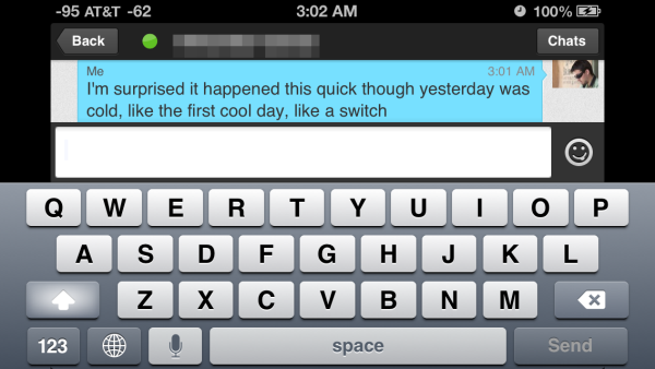
For third party applications however that road to 16:9 for the iPhone 5 and newest iPod Touch display requires some tweaking, and a trip through the App Store approval process, otherwise you end up with letterboxing. There’s really nothing else that Apple could’ve done besides letterboxing to accommodate older apps that either aren’t updated or will never be updated, but the downside of this centered letterboxed experience is that it shifts portrait apps and the keyboard up by 88 pixels.
A great example of where this is jarring is the IM application I use, imo.im, which hasn’t been updated as of this writing to take advantage of the new viewport size. As a result, typing on this 88-pixel-shifted keyboard requires repositioning one’s grip. This is a temporary grievance though that will go away in time as developers update things, but still warrants mentioning. It’s similar to but not identical to the same kind of friction we saw with the path to retina-enabled apps with the iPhone 4 launch.
In-Cell
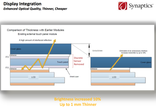
The next major improvement is in-cell touch. The iPhone 5 isn’t the first smartphone to include an in-cell touch LCD, but perhaps the first where we’ve seen lots of talk about it. Part of getting to even thinner form factors is either eliminating or reducing the thickness of everything in the z direction. In addition, increasing the light throughput of the display stack (which means both filters and everything between the backlight LEDs and your eye) is a huge driver for overall battery life, since the display is still by far the largest consumer of precious milliwatts in a smartphone.
One of those things is the digitizer, which previously sat on top of the LCD as a separate layer incurring both additional thickness and back reflections. While successive generations of both iPhone display stacks (and the smartphone platform in general) have eliminated a lot of back reflections by reducing the number of air-glass interfaces with optical-grade adhesive lamination (and thus 4 percent Fresnel reflections that go along with each of them), ultimately these glass-adhesive interfaces still incur some path loss and still have a z profile. The only way to reduce these further is to go to in-cell touch, which really is a fancy way of saying that the digitizer is then integrated into the LCD-TFT gating itself, and thus into the cells of each pixel, rather than as a discrete layer atop the stack after color filters.
Getting to this level of integration requires cooperation between both the display driver and touch sensor, and herein lies the challenging engineering problem that in-cell touch poses. Touch sensing has to be time multiplexed with display driving otherwise the touch signal might be entirely lost in noise. At the same time, touch sensing is often around double the frequency (120–175 Hz) of display drawing (60 Hz), so this has to be done carefully during quiet periods, and thus that required communication and integration. The iPhone 5 uses a combination of TI and Broadcom controllers to do display controller and touch sensing, where previous generations of iPhone simply just used a single chip TI solution. In future generations this will come back down to just being a single-chip solution.
Subjectively thus far I haven’t detected any change in tracking quality or performance with the iPhone 5’s in-cell solution, which is great. To end users the difference seems to be totally transparent.
In addition to just the air-adhesive interfaces introducing thickness and unavoidable Fresnel reflections, there’s also the traces from transparent conductors in the digitizer as well to think about. At present that material is Indium Tin Oxide (ITO), which is one of very few known transparent conductors and used inside every LCD. Because Indium is a relatively expensive rare earth metal, ITO traces are only laid down where they need to be on top of and below the glass substrate (for both transmit and receive layers of the digitizer), and the areas inbetween those traces are then filled with an index-matching space fill material to diminish their visibility. How well this space fill is done and how close the index is to ITO’s is one of the quality metrics of a digitizer to begin with, and often these rows and columns are visible under direct illumination either outdoors or with good eyes indoors. Often you can tell a lot about how much value an OEM placed on its entire digitizer just by how distracting these are outdoors, but the big benefit with in-cell is that they go away entirely, which is a huge gain I rarely see people talking about in the context of in-cell improvements.
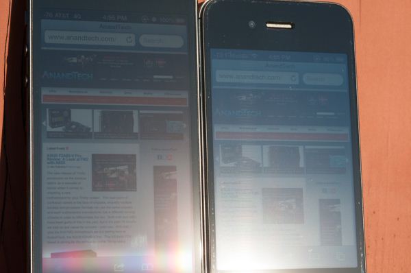
Horizontal lines on the iPhone 4S (right) from the digitizer (easier to see at full size)
That change leads to what I would consider a huge improvement in outdoor visibility, since these lines are now totally gone on the iPhone 5. In addition, there’s no longer a contrast-diminishing set of back reflections from the extra glass layer when outdoors. This is very visible in the photos I’ve taken showing outdoor viewing behavior on both the iPhone 4S and iPhone 5.
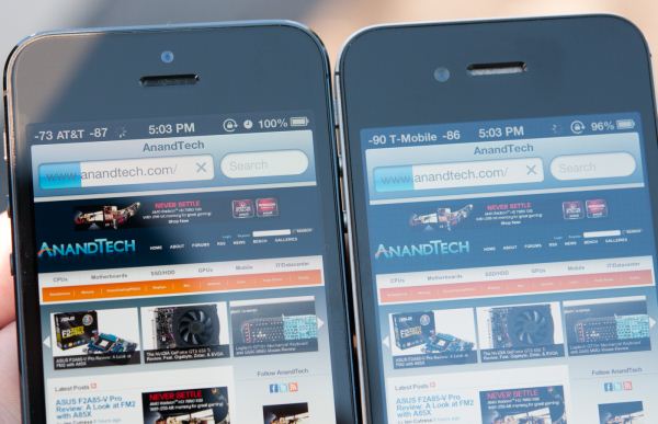
Significantly less blue haze on the iPhone 5 (left) than iPhone 4S (right)
Display Quality
Our own Chris Heinonen already did an excellent job characterizing the iPhone 5 display using our new CalMAN 5 based test suite he put together, and I’d encourage everyone to read that for a much more comprehensive version of an iPhone 5 display analysis. There’s really not a whole lot for me to add other than some results from the two other main smartphone displays I’ve tested with this new workflow, and some graphs with data from other phones. Chris has better instrumentation than I do with an i1Pro, but we’ve tweaked the workflow slightly so I ran the iPhone 5 and 4S through the test. In addition Apple has multiple suppliers for the iPhone 5 display so there are bound to be some differences in devices.
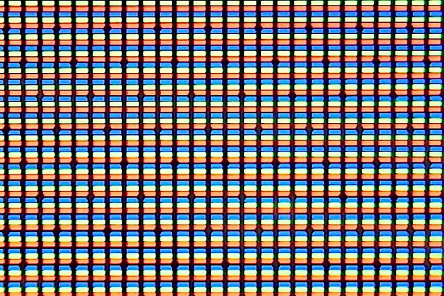
Subpixel geometry and size is still the same on the iPhone 5, meaning this is still a “retina” display and all the usual discussion about angular subtense and visual acuity still applies. You can see this under the microscope (all these images are at the same magnification, focus is a bit different though given the different optical path length thanks to that in-cell touch) — both the geometry and pixel pitch are unchanged between the 4S and 5.
To start are our brightness and contrast graphs which are measured at 100 percent brightness. The iPhone is even brighter than the iPhone 4 and 4S displays, at just over 600 nits on my unit. I saw some variance back between the iPhone 4 and 4S in brightness, so depending on where you’re coming from this can be a noticeable jump. Apple started off with good consistency when the iPhone 4 came out, but I saw lots of white point and luminance variance with that form factor display as time progressed and we moved from the 4 GSM to 4 CDMA to 4S.
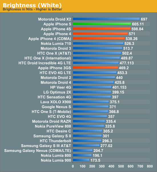
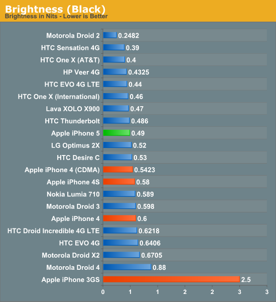
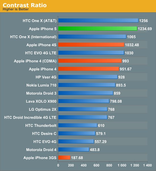
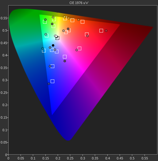
When it comes to gamut, Apple announced that the iPhone 5 display has full sRGB coverage. The iPad 3 was actually first in Apple’s lineup to advertise roughly full sRGB coverage, but it appears that the iPhone 5 is even closer to being spot on. Using our new CalMAN workflow we can easily measure and compare the overall saturations for primaries and secondaries, the ideal values of which are represented by white boxes. There’s a whole lot of measuring required for each phone, so I pared it down to just the iPhone 5, 4S, HTC One X, and Galaxy S 3 for the moment.
Saturations and Gamut
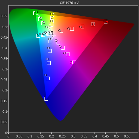
The iPhone 5 is, like Chris said already, the closest smartphone I’ve seen to sRGB to date. It’s really clear to me that Apple puts a strong emphasis on its suppliers to both deliver a display capable of hitting that gamut, and then bothers to do some factory level calibration to get reasonably close. I’ve seen this drift over time but for the time being the iPhone 5 is quite close to being ideal all things considered.
The GretagMacbeth ColorChecker card test colors are next up, and it isn’t surprising here to see some variance, but the values from the iPhone 5 are very close to the intended colors compared to the competition and its predecessor.
GMB Color Checker
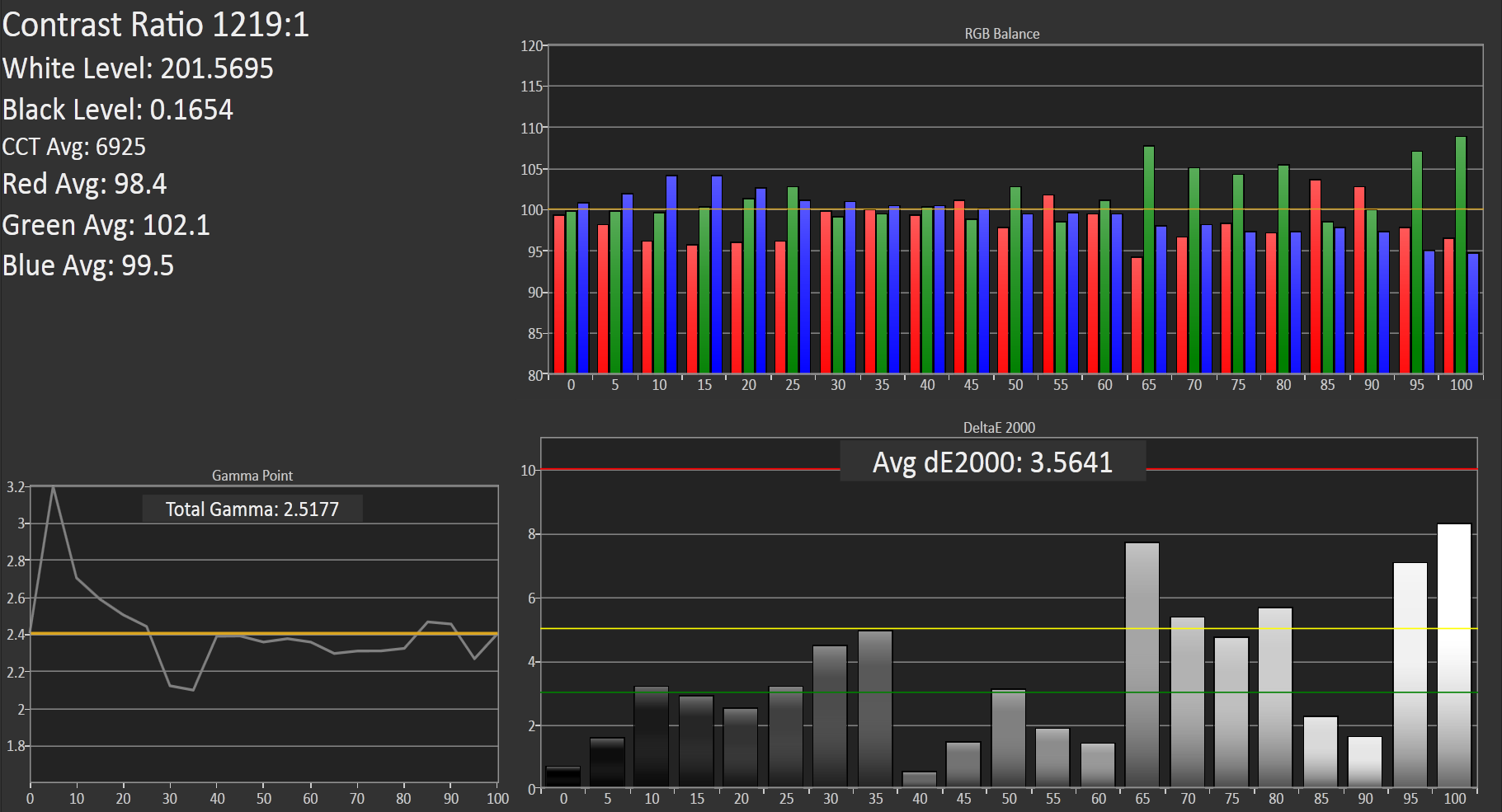
Grayscale and gamma represents our steps of 5 percent grey from 0 to 100 and we get a report for contrast, the white and black levels, color temperature, gamma, and average Delta E 2000 here.
Grayscale and Gamma
My values differ from Chris’ slightly, but my instrumentation and phone are both different from his which may explain some of the differences. The high level story is the same though, the iPhone 5 tracks closer to the ideal than any of the other devices. I’ve also gone ahead and made a table with the average Delta E from each step.
| CalMAN Display Comparison | |||||||
| Metric | iPhone 5 | iPhone 4S | HTC One X | Samsung Galaxy S 3 | |||
| Grayscale 200nits Avg dE2000 | 3.564 | 6.162 | 6.609 | 4.578 | |||
| CCT Avg (K) | 6925 | 7171 | 5944 | 6809 | |||
| Saturation Sweep Avg dE2000 | 3.591 | 8.787 | 5.066 | 5.460 | |||
| GMB ColorChecker Avg dE2000 | 4.747 | 6.328 | 6.963 | 7.322 | |||
Last up is the indoor viewing angles comparison between the iPhone 5 and the 4S, which are essentially unchanged. Even at extreme angles I can’t detect any major differences in viewing angle between the 4S and the 5, which is a good thing since there isn’t really anything to complain about.




276 Comments
View All Comments
dado023 - Tuesday, October 16, 2012 - link
These days for me is battery life and then screen usability, so my next buy will be 720p, with iPhone5 setting the bar, i hope other android makers will follow.Krysto - Tuesday, October 16, 2012 - link
Are you implying iPhone 5 is setting the bar for 720p displays? Because first of all, it doesn't have an 1280x720 resolution, but a 1136x640 one, and second, Android devices have been sporting 720p displays since a year ago.hapkiman - Tuesday, October 16, 2012 - link
I have an iPhone 5 and my wife has a Samsung Galaxy S III.Her Galaxy S III has a Super AMOLED 1280x720 display.
And yes my iPhone 5 "only" has a 1136 x 640 display.
But guess what - I'm holding both phones side by side right now looking at the exact same game and there is no perceivable difference. I looked at it, my son looked at it, and my wife looked at it. On about five or six different games, videos, apps, and a few photos. The difference is academic. You cant tell a difference unless you have a bionic eye.
They both look freakin' fantastic.
reuthermonkey1 - Tuesday, October 16, 2012 - link
I think you're missing Krysto's point. Of course looking at a 4" 1136 x 640 and a 4.8" 1280x720 display side by side will look equivalent to the eye. But his response wasn't to whether they're similar, but to the minimum requirement dado023 has set for their next purchase to be 720p.The iPhone5's screen looks fantastic, but it's not 720p, so it's not exactly setting the bar for 720p.
Samus - Wednesday, October 17, 2012 - link
I'm no Apple fan, but in their defense, it is completely unneccessary to have 720p resolution on a 4" screen.The ppi of the screen is already 20% higher than is discernible by the human eye. Having the resolution any higher would be a waste of processing power.
afkrotch - Wednesday, October 17, 2012 - link
More screen real estate. Higher resolution, more crap you can throw on it. Course ih a 4" or 4.8" display, how many icons can you really place on the screen. I have a 4" screen and I wished I could shrink my icons though. Would love to get more icons on there.I can't do large phones anymore. I had a 5" Dell Streak...no thanks. Too big.
rarson - Wednesday, October 17, 2012 - link
"The ppi of the screen is already 20% higher than is discernible by the human eye."Uh, no it's not. The resolution of a human retina is higher than 326 ppi.
Silma - Thursday, October 18, 2012 - link
This doesn't mean anything. It depends on how far away the reading material is from the eye.720p may not be needed for such a small screen but it is better than "not exactly" 720p in that the phone doesn't have to rescale 720p material.
In the same way retina marketing for macbook is pure BS as for the screen size and eye distance from the screen such a high resolution is not needed and will only burn batteries faster and make laptops warmer for next to no visual benefit. In addition 1080p materials will have to be rescaled.
rarson - Thursday, October 18, 2012 - link
Right, so if you have good vision, like I do, then at a foot away, you can see those pixels.MobiusStrip - Friday, October 19, 2012 - link
Yawn.